IELTS Writing Task Part 1 Bar graph # Salaries of various professions

IELTS Writing Task Part 1:

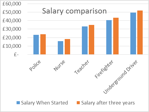
The chart above shows information about various professions in the U.K. and their salaries. The table shows the average working hours per week for each profession.


Summarize the information by selecting and reporting the main features, and make comparisons wherever relevant.

Graph Best IELTS BAND 7 Coaching Dehradun

Profession Average working of hours per week
Police 40
Nurse 38
Teacher 55
Firefighter 55
Underground Driver 36
Sample Answer

The bar graph shows the salaries of various professions when they started, compared with their salaries after three years. The adjoining table also contains data for the average working hours for each profession per week.

It can be deciphered that the salaries after three years have increased for each profession. However, the underground train driver got the maximum increment of 2500 Pounds, and the policeman got the least increment of 600 Pounds. The nurse got the least salary amounting to only approximate 15,700 Pounds, whereas the underground train driver got just under 50,000 Pounds which was the highest amount of salary in comparison. On the other hand, the teacher and the policeman get slightly more than 23,000 Pounds and 33,000 Pounds respectively.

Comparing this data to the working hours per week, it is found that the underground train driver is being paid the most amount of money per hour and nurse being paid the least. In contrast, the teacher and firefighter have 55 working hours which are the highest. Moreover, the nurse and the underground train driver have 38 and 36 working hours respectively, which are the lowest.

To sum up, even after three years and a substantial raise of salary for each profession, the trend does not change and the tube driver was still topping the chart and the nurse on the last position.

phone icon

IELTS Dehradun Uttarakhand Tel: 8439000086 , 8439000087

IELTS WRITING TASK 1 Graph #Canadian College

IELTS WRITING TASK 1
You should spend about 20 minutes on this task.
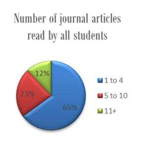
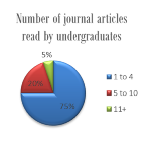
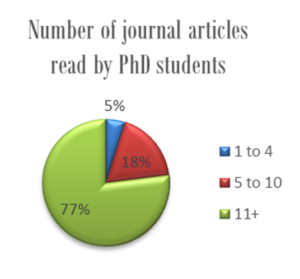
The given pie charts provide information about the number of journal articles read per week by all students, undergraduates, and PhD students at a Canadian College in 2015.
Summarise the information by selecting and reporting the main features, and make comparisons where relevant.
Write at least 150 words.
IELTS Band7 College one IELTS Band7 College three IELTS Band7 College
Sample Answer
The pie charts show how many articles from academic journals were read weekly by undergraduates and PhD students compared to other students at a Canadian College in the year 2015.
Looking at the details, a sizeable majority (75%) of undergraduate students read 1-4 articles per week. In comparison, the average for the entire student body in this category was slightly lower, 65 per cent.  Furthermore, 20% first degree seekers read between 5 and 10 articles a week.  The percentage of average students in this reading group was 3% higher. For the third category, fewer undergraduates read over 11 articles compared with the average student. The figures were 5 per cent and 12 per cent respectively.
Meanwhile, for PhD students the pattern was substantially different. Most read 5 or more articles per week (95%) and out of this total 77 per cent read at least 11 articles a week, which was almost fifteen times the corresponding figure for undergraduates. Notably, only 5% students researching for a PhD read 1-4 articles a week.
Overall, what stands out from the data is that the students who were studying doctorates read more articles per week than either undergraduates or other students.
(197 Words)
IELTS BAND 7

Contact us at –

IELTS Dehradun Uttarakhand Tel: 8439000086

IELTS Writing Task1: Police Officers and Criminals in Two Cities

Recent IELTS Writing Task 1

You should spend about 20 minutes on this task.

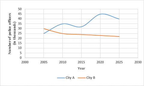
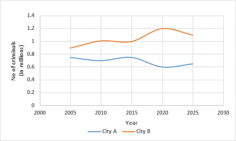
The line graphs below show the number of police officers and criminals in two cities since 2005 and predicted figures up until 2025.

Summarise the information by selecting and reporting the main features, and make comparisons where relevant.

Write at least 150 words.


IELTS Band7 Writing Task 1 Police officers in two cities since 2005 and predicted figures up until 2025

Police officers in two cities since 2005 and predicted figures up until 2025


IELTS Band7 Writing Task 1 criminals in two cities since 2005 and predicted figures up until 2025

Criminals in two cities since 2005 and predicted figures up until 2025


Sample Answer:

The line graphs illustrate the variation in the proportion of police officers and offenders in two cities, city A and city B, over a period of two decades between 2005 and 2025.
In 2005, city A had 25000 police officials whereas the number of officers in city B was comparatively higher, 30000. In the next 5 years, city A experienced a significant rise of 10,000 in the proportion of its police officers. In contrast, the trend for city B was downward and the numbers dropped to 25000 in 2010. Between 2010 and the present, city A’s police figures fluctuated while that of city B decreased slightly. According to future predictions, the number of police officers in city A will reach the mark of 45,000 in 2020. These figures are expected to decline to 40,000 in 2025. In comparison, city B will have only about 22,000 police officers between the present and 2025.
According to the second line graph, the number of criminals in city A and city B stood at nearly 0.9 million and 0.7 million respectively in 2005. In the next decade, city A’s figures dropped slightly while that of city B rose gradually to 1 million. In the future, city A will have about 0.6 million offenders. In contrast, the numbers in city B will be significantly higher, in the range of 1.1 to 1.2 million.
Overall, the number of police officers in city A has increased since 2005 while that of criminals has dropped. But, the trend for city B has been the reverse during this period i.e. fewer police officers and more criminals. (267 Words)


IELTS BAND 7

IELTS ACADEMIC WRITING TASK 1 BAR GRAPH

IELTS ACADEMIC WRITING TASK 1
You should spend about 20 minutes on this task.
The bar graph below shows the net worth of the UK from 2000 to 2010 according to three sectors.
Summarise the information by selecting and reporting the main features, and make comparisons where relevant.
Write at least 150 words.


IELTS BAND 7 GRAPH


ANSWER:

The bar chart highlights the variation in the total wealth of the UK according to three different sectors over a decade (2000 -2010).
Between 2000 and 2002, the UK household net wealth remained fairly stable at about £4,500. The figures for both households and government sectors rose consistently in the following years until the economic downturn in 2008. In that year, the net worth of UK households dropped to about £6,000 billion, a significant decrease of approximately £800 billion compared with 2007. Interestingly, UK households wealth recovered in the next two years but the government’s net worth went into negative figures in 2010. It is important to note that throughout the given period the government’s wealth was comparatively much lower than that of the households.
Looking at the total wealth of the UK between 2000 and 2010, the figures were on a par with that of UK households. In six of the ten years represented in the chart, UK households were worth approximately 5% to 10% more than the UK total. For just under a third of this period, in the years 2002 to 2004, the UK total was equal to or greater than the total worth of UK households. Although, the net worth of business in the country improved from 2000 to 2002, this trend did not last and began to worsen again only a year later. From 2005 to 2007, although the rest of the country experienced continued growth, the wealth of business returned to the 2000 levels.
Overall, the total wealth of UK households and the government sector followed an upward trend in the given time period except in 2008. Surprisingly, the business sector remained the least growing section of the UK economy.

1 3 4 5 6 7 8