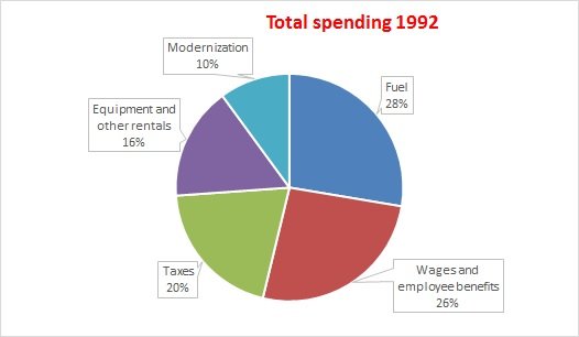
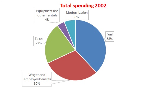
Annual Spending of the Indian Rail Industry # Pie Chart
Question Writing task 1
You should spend about 20 minutes on this task.
The three pie charts show the annual spending of the Indian rail industry in 1992, 2002 and 2012.
Answer: (Level band 8.5)
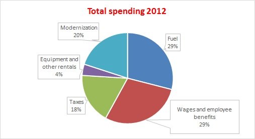
The pie charts illustrate the variation in the running costs of the Indian railway in three separate years 1992, 2002 and 2012.
In all three years, the greatest expenditure was on fuel and workers’ salaries including benefits. Fuel spending increased dramatically from 28% in 1992 to 38% in 2002 but the expenses reduced to their nominal value of 29% in 2012. Approximately, employees wages and benefits used the same proportion, 26-30%.
In the year 1992, one fifth of the annual budget went towards taxes and slightly less, 16%, was spent on resources such as equipment and rentals. Surprisingly, the smallest fraction, 10%, was expended on the modernization of railways in this year. In the next two decades, there were small fluctuations of the order of two percent in the expenditure on taxes. Comparitively, the budget for equipment saw a downward trend, ending at only four percent of the total in 2012. In a sharp contrast, the spending on railway development experienced a rising trend, growing from only 6% in 2002 to a whooping 20% by 2012.
Overall, staff salaries and fuel constituted the largest cost to the Indian railway, and while figures fluctuated for most categories, the modernization expenditure went up significantly.
![]()
8439000086
8439000087
7055710002
7055710003