Sales In Random Stores # Pie Chart

The pie chart shows the number of sales of two different random stores in India for the quarter of the year 2012.

Summarise the information by selecting and reporting the main features, make comparisons where relevant.
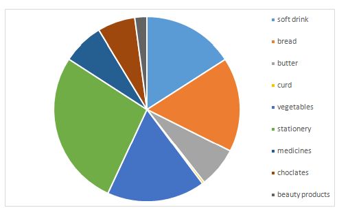
 

STORE A

STORE A

STORE B

STORE B


SAMPLE ANSWER

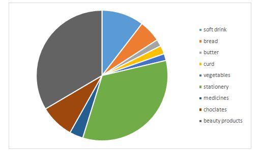
The pie chart compares the number of sales of nine different products of two different random stores in India, for the quarter of the year 2012.

Overall, it can be seen that stationery was the major selling product in both the stores, while curd was one of the least sold for the quarter. Although the sales of different products remained almost similar in store A, major disparities in the sales were observed in store B. Beauty products were sold the least in store A whereas it was the major selling product in-store B bread. In addition,  butter and vegetables showed opposite trends.

In detail, in-store A, vegetables, stationery, bread and soft drink were bought the most. Apart from these, medicines, chocolates and butter shared almost equal sales with beauty products being sold the least.

For store B, the major selling products were stationary and beauty. Soft drink and chocolates had almost equal sales with bread being the next most sold item. Other than these items, butter, curd, vegetables and medicines also had their share in being bought.


Feel free to call for suggestions and queries.

phone icon

8439000086

8439000087

7055710003

7055710004

IELTS Band 7 Dehradun
Near Ballupur Chowk, Dehradun

email: info at ieltsband7.com

IELTS online simulator

IELTS BAND 7 Home page

IELTS Graph # temperatures in three cities

WRITING TASK 1
You should spend about 20 minutes on this task.
The line graph below shows the average monthly temperatures in three major cities.
Summarise the information by selecting and reporting the main features, and make comparisons where relevant.
Write at least 150 words.


IELTS WRITING TASK 1 Graph

IELTS WRITING TASK 1 Graph

Sample Answer:

The line graph provides information about how the mean monthly temperatures vary in Paris, Dubai and Sydney over the course of a year.

One striking feature of the graph is that Paris experiences its lowest temperatures in December/January. In the following six months, the mercury rises gradually and hits its peak at 20°C in July/August. From September onwards, the figures drop steadily before reaching their minimum value of around 5°C in December/January. Interestingly, the temperature patterns for Dubai are similar to Paris, although it has warmer winters and hotter summers. The lowest and highest temperatures in Dubai are around 20°C and 36°C respectively.

On the other hand, the temperature variations in Sydney are opposite to that observed in Paris and Dubai. Sydney has its hottest weather in December/January when the mercury hovers around 23°C. In the next six months, there is a gradual decline in the mercury levels which reach their lowest level of nearly 13°C in July. Thereafter, the temperature follows an upward trend until December.

Overall, the mean monthly temperatures are the highest in Dubai and are the lowest in Paris. In comparison, Sydney has moderate mercury levels throughout the year.


Feel free to call for suggestions and queries.

phone icon

8439000086

8439000087

7055710003

7055710004

IELTS Band 7 Dehradun
Near Ballupur Chowk, Dehradun

email: info at ieltsband7.com

IELTS online simulator

IELTS BAND 7 Home page

IELTS WRITING Task1 Chart # Schools Survey

IELTS WRITING TASK 1
You should spend about 20 minutes on this task.
The pie chart below shows the results of a survey of the causes of poor learning outcomes in schools in a particular country in 2011.
Summarise the information by selecting and reporting the main features, and make comparisons where relevant.
Write at least 150 words.


IELTS-Band7 Dehradun

IELTS WRITING Task 1 Pie Chart # Schools Survey

Sample Answer

The pie chart highlights people’s views from a survey of the reasons behind poor academic outcomes in a country in 2011.

People attributed bad performance in schools to a number of causes. These included working parents, lack of revision, inadequate facilities, unskilled teachers and upbringing. Among all the five listed causes, unskilled teachers was cited by the maximum number of those surveyed at 35%. This was followed by the way a child is brought up, a cause quoted by 27% of the poll sample. Only one in five participants ascribed unsatisfactory school results to working parents. Lack of facilities and revision were considered by fewer respondents, 10% and 8% respectively.

In general, both school related and home environment related causes were held accountable for low educational attainment. Notably, total percentages of people who cited these factors were not significantly different, 53 percent versus 47 percent. However, it is clearly evident that most participants blamed untrained teachers for below average academic results.

(161 Words)


Feel free to call for suggestions and queries.

phone icon

8439000086

8439000087

7055710003

7055710004

IELTS Band 7 Dehradun
Near Ballupur Chowk, Dehradun

email: info at ieltsband7.com

IELTS online simulator

IELTS BAND 7 Home page

IELTS Graph – Club preferences by age range

IELTS WRITING TASK 1

You should spend about 20 minutes on this task.
The bar graph below represents the data about the clubs joined by the people of two different age groups at a leisure center.
Summarise the information by selecting and reporting the main features, and make comparisons where relevant.

IELTS Graph

Sample Answer:

(IELTS Lavel 8.5)
The bar graph compares the popularity of six activity clubs between two adult age groups at a particular leisure center.
OR
The bar graph provides information about how two age groups participate in six activity clubs at a particular leisure center.

One striking feature of the data is that the photography, fitness, and music/dance clubs are popular with both older and younger people. By Contrast, the cycling, arts and crafts, and gardening activities clearly appeal more to one of the age groups. The cycling club has the greatest number of 25-35 year-olds, but it is one of the least popular clubs with the older age group.

This trend is closely followed by the arts and crafts club which has 60 young members in comparison with only 20 from the 55-65 age bracket. In the gardening club, the pattern is reversed. There are about 55 members aged between 45 and 55 while the proportion of young participants is considerably lower. Notably, the composition of fitness and music/dance clubs is quite balanced, but there are slightly fewer older members. The membership of photography club stands at 45 for both groups.

In general, it can be concluded that some clubs attract both young and old people. Nonetheless, overall, the younger age group is significantly more involved in various activities than the 55-65 year-olds. (220 Words)


Feel free to call for suggestions and queries.

phone icon

8439000086

8439000087

7055710003

7055710004

IELTS Band 7 Dehradun
Near Ballupur Chowk, Dehradun

email: info at ieltsband7.com

IELTS online simulator

IELTS BAND 7 Home page

1 2 3 5