Deaths In Venus # Graph For IELTS

The graph below shows the number of deaths in Venus during the year 1029-1031.

Summarise the information by selecting and reporting the main features, make comparisons where relevant.

Deaths In Venus

Deaths In Venus

The chart illustrates the number of deaths caused by six diseases ( Aids, leprosy, tropical disease, diarrhoea, malaria and TB) in Venus over a period of 2 years from 1029-1031.

Overall, Aids, diarrhoea and TB remained the dominant diseases, causing the highest number of deaths while malaria was held responsible for the least number of deaths. The number of deaths caused by Leprosy were higher than malaria, however were not as dramatically high as that of the dominant diseases.

Over the period of two years, Aids and TB had taken a turmoil on the lives of individuals of Venus causing almost the same number of deaths. Around 50000 lives were lost because of the two deadly diseases with deaths caused by TB being only slightly less than the former.

The number of individuals dying because of  malaria and leprosy were comparatively low causing approximately 10000 deaths.


Understanding Graphs – 1

To explain graph properly, it is very important to understand the different types of graphs that come in IELTS. I know you must have heard of pie chart, line graph, tables, but let us have a look at the graphs from a new perspective.

  1. Static Graphs
  2. Dynamic Graphs

Static Graphs – These are the graphs that show data over a certain period of time.

Dynamic Graphs- These are the graphs that show data over a period of time.

Let us have a look at each type of the graph.

Dynamic Graphs –

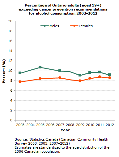
The graph below shows the percentage of Ontario adults, exceeding cancer prevention recommendations for alcohol consumption, from 2003 to 2012.

Summarize the information by selecting and reporting the main features, and make comparisons where relative.

Write at least 150 words.

Percentage Of Adults

Percentage Of Adults

As you can see, the graph is dynamic because it shows data over a period of time. We should therefore look at the general trend over the time period.

First we need to look at what happened to both the lines from the start to the end. We can see that the green line decreased a bit, while the orange line increased little. Now, let us have a look at both the lines separately. The green line increases till 2005 and then decreases till 2009, finally lowering at 2012.The orange line increases till 2007, decreases till 2009 and then increases till 2012.

These are the most striking or most obvious things we can see when first looking at the graph and these are perfect for our overview.

Let’s put this information into a sentence:

Over the entire period of time, number of males and females, exceeding cancer prevention, showed opposite trends. Females saw a steady increase till 2007 before declining till 2009 and then marking an overall increase. While, percentage of males rocketed, reaching highest point in 2005, before ending up at a decrease in 2012.

When we are looking at dynamic graphs we should be looking out for:

  • What does the data do from the start to the finish?
  • Do they generally go up or down or do they fluctuate?
  • Any significant difference from the general trend?
  • Overall increase/decrease?
  • Peaks/lows?

IELTSBAND7

IELTS Sample Answer # Graph wheat exports

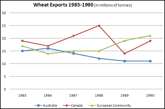
The graph below shows the wheat exports in three countries during the year 1985-1990 in millions of tonnes.

Summarize the information by selecting and reporting the main features, and make comparisons where relevant.

wheat exports in 1985-1990

wheat exports in 1985-1990

Sample Answer

The graph shows the variation in the amount of wheat exported in three countries over a period of five years i.e. 1985-1990.

Initially, in the year 1985, there wasn’t a major difference in the exports among the three countries, with Australia having 15 million tonnes wheat exported, while Canada and European Community exported approximately 18 and 20 million tonnes respectively.

For the next four years i.e 1986 to 1989, Canada experienced its highest wheat export in the year 1988 at 25 million tonnes and lowest peak of overseas sales when it dropped down to 15 million tonnes in 1989. During this period, Australia witnessed a gradual decrease from 15 million tonnes to 10 million tonnes. However, in contrast, European Community after hitting its lowest point in 1986 saw an increase in the amount of wheat brought to Europe in 1987 which remained constant until 1988.

Finally, in the year 1990, Canada and European Community exported 12 million tonnes of grain marking a gradual increase in their wheat trade. On the other hand, figures remained constant for Australia.

Overall, Australia observed a decline in its wheat export while the European Community witnessed an opposite trend. In contrast, there were major fluctuations in the wheat export in Canada.

THIS IS A BAND 7 ANSWER

Learn the art of describing graphs effectively at  IELTSBAND7

phone icon

08439000086, 08439000087, 07055710002, 07055710003,
IELTS Band 7 Dehradun
323,GMS Road, Above Axis Bank,
Near Ballupur Chowk, Dehradun , India – 248001

IELTS online simulator

IELTS BAND 7 Home page

1 9 10 11