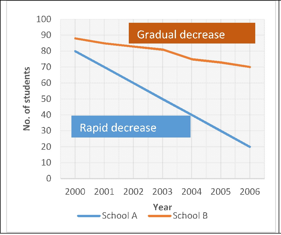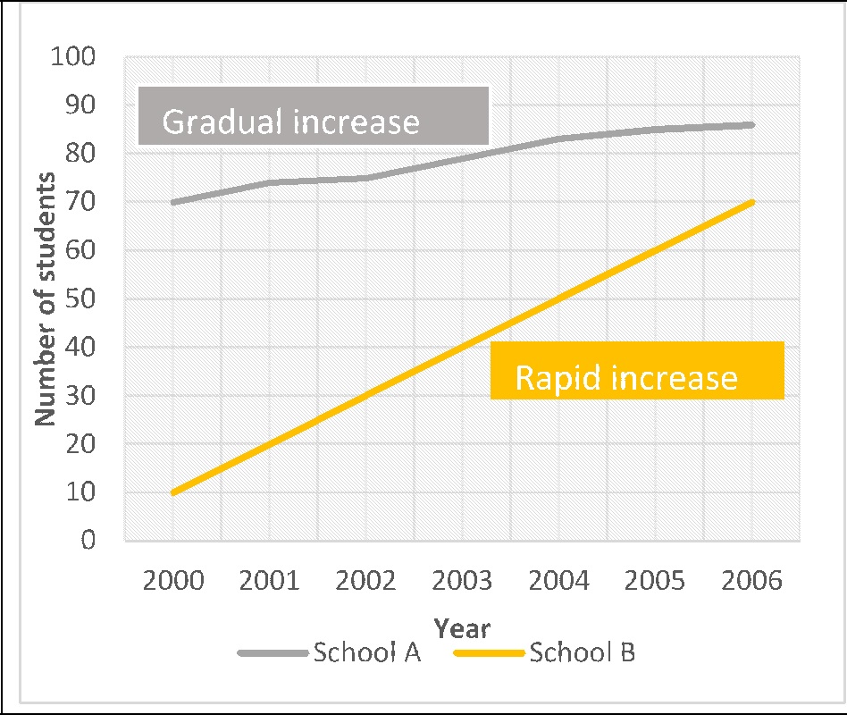
IELTS Task 1: Identify stable and fluctuating trends
IELTS Task 1: Identify stable and fluctuating trends
IELTS Task 1: Identify stable and fluctuating trends.
Related Vocabulary
| For constant trends | For Fluctuations |
| Stayed constant at
Remained unchanged at Did not change Remained stable at Levelled out at Levelled off at Maintained the same level |
Small fluctuations of the order
of N percent Wild fluctuations Figures fluctuated |
Example
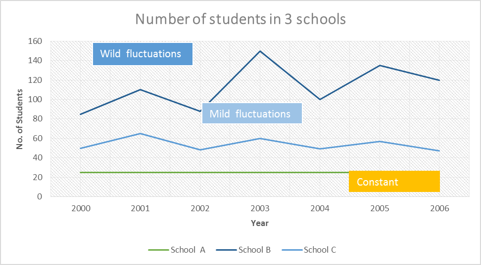
In 2000, School B topped the list with about 85 students whereas school C and A stood at second and third position respectively with nearly 50 and 22 pupils. In the next 6 years, the number of students in school A remained constant. On the other hand, school B witnessed wild fluctuations in its figures which reached the peak at about 140 in 2003, followed by a gradual decline to 120 in the year 2006. In comparison, school C experienced regular fluctuations of the order of 10 percent. Nevertheless, the number of pupils in 2006 was roughly the same as in the year 2000.
![]()
IELTS Dehradun Uttarakhand Tel: 8439000086 , 8439000087