Identify Decreasing Trends in IELTS Task 1

How to Identify Decreasing Trends in IELTS Task 1
decrease IELTS Band 7 Dehradun

Related Vocabulary

Declined to
Decreased to
Dropped to
Fell to
Dipped to
Reduced to
Went down to
Slumped to
Plummeted to
Hit the minimum


Example:

In 2000, the school A had 80 students. In the next three years, the number of children declined rapidly to 50 and hit the minimum of 20 in the year 2006. In comparison, there were more students in school B in 2000 but the figures dropped gradually in the following years before ending at about 80 pupils in 2006.

phone icon

IELTS Dehradun Uttarakhand Tel: 8439000086 , 8439000087

Increasing Trends in IELTS Task-1

Trends are the most important part of the IELTS exam. Trends can either be increasing or decreasing. Sometimes it even remains constant. It is essential for you to know how to describe trends in a better way. This time we bring you the best way in which you can explain increasing trends in IELTS writing.


Example:

 How to Identify Increasing Trends in IELTS Task-1 ?

IELTS Task1 Graph increase Dehradun
Increased to
Rose to
Climbed to
Went up to
Leapt to
Boomed to
Soared to
Rocketed to
Surged to
Hit the mark of

Touched the mark of

Hit the maximum

In 2000, there were 70 children in school A. The number of students increased gradually to about 85 in the next six years. In comparison, school B had only 10 students in the year 2000 but the figures increased rapidly in the following years and hit the mark of 70 pupils in 2006.

Overweight Adults Population Graph

IELTS ACADEMIC WRITING TASK 1 # Overweight Adults Population Graph

You should spend about 20 minutes on this task.
The chart below gives Information about the percentage of the adult population who were overweight in four different countries in 1980, 1990 and 2000.
Summarise the information by selecting and reporting the main features, and make comparisons where relevant.
Write at least 150 words.

overweight adults ielts Dehradun

overweight adults ielts Dehradun

The bar chart illustrates the variation in the proportion of obese adults in four different regions in 1980, 1990 and 2000.
One striking feature of the chart is that Japan had the lowest proportion of corpulent people in all three given years. Figures stood at about two percent in the 80s and 90s and rose by only one percent in 2000, indicating that the degree of change was the smallest in Japan.
Looking at Finland and Australia, around six percent Finnish and Australians were overweight in 1980. By the end of the period, the proportion of obese Finnish had almost doubled while that of Australians nearly tripled, reaching approximately 20%. This shows that the rate of increase in Australia was much higher than Finland.
Focusing on the distribution of overweight adults in America, it is clear that the USA had the highest percentage of obese people in each of the given years. The percentage rose from 15% in 1980 to a whopping 30% in 2000.
Overall, it can be concluded that the population of corpulent adults increased in all four countries, but the scale of problem and the rate of rise was greater in Australia and America.

Annual Spending of the Indian Rail Industry # Pie Chart

Question Writing task 1

You should spend about 20 minutes on this task.
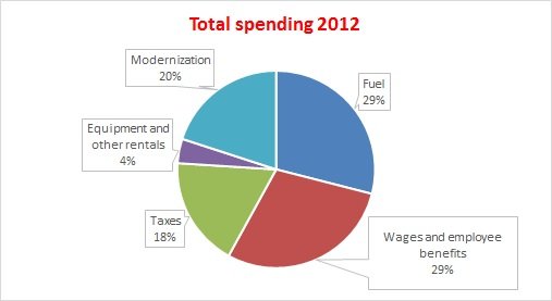
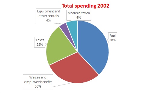
The three pie charts show the annual spending of the Indian rail industry in 1992, 2002 and 2012.
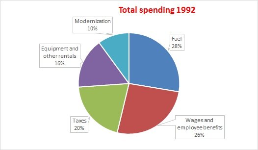
 

IELTS Dehradun topic: Annual spending of the Indian rail industry

The pie charts illustrate the variation in the running costs of the Indian railway in three separate year 2002.


IELTS Dehradun The pie charts illustrate the variation in the running costs of the Indian railway in three separate year 2012.

Answer: (Level band 8.5)

The pie charts illustrate the variation in the running costs of the Indian railway in three separate years 1992, 2002 and 2012.

In all three years, the greatest expenditure was on fuel and workers’ salaries including benefits. Fuel spending increased dramatically from 28% in 1992 to 38% in 2002 but the expenses reduced to their nominal value of 29% in 2012. Approximately, employees wages and benefits used the same proportion, 26-30%.

In the year 1992, one fifth of the annual budget went towards taxes and slightly less, 16%, was spent on resources such as equipment and rentals. Surprisingly, the smallest fraction, 10%, was expended on the modernization of railways in this year. In the next two decades, there were small fluctuations of the order of two percent in the expenditure on taxes. Comparitively, the budget for equipment saw a downward trend, ending at only four percent of the total in 2012. In a sharp contrast, the spending on railway development experienced a rising trend, growing from only 6% in 2002 to a whooping 20% by 2012.

Overall, staff salaries and fuel constituted the largest cost to the Indian railway, and while figures fluctuated for most categories, the modernization expenditure went up significantly.

phone icon
8439000086
8439000087
7055710002
7055710003

 

1 8 9 10 11