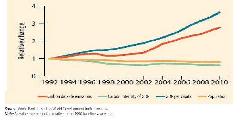
Prime Age Employment # Line Graph

The graph shows the percentage of men with different degrees, involved in prime age employment, in Unite d States, over a period of, 2000 to 2012.
Summarize the information by selecting and reporting the main features and make comparisons where relevant.
Write at least 150 words.

Prime Age Employment

Prime Age Employment


The graph indicates what percent of men, in United States, attained prime age employment, having different educational qualifications; less than high school, high school diploma, some college, college degree or advanced degree.

Between 2000 and 2012 percentage of men doing prime age employment, changed to some extent, in all five categories, but the most marked change was in men having high school diploma or some college degree. At the beginning of the period the proportion of such men employed in prime age was slightly lower than the ones with college or advanced degree. However, by 2012 this figure had
declined to nearly 80 percent.

The other category wherein the percentage of employment fell over the period was ,less than high school. However, the changes here were much less dramatic. Proportion of men involved in prime age employment remained nearly steady till 2008 when it dipped by few percent; observing a significant increase after 2008.

In two categories, college and advanced degree, the proportion of men employed remained steady, indicating a slight decline during 2008, after which it remained nearly constant. Thus, by the end of period, the highest proportion of men in prime age employment had advanced degree, and the lowest proportion had less than high school.

In conclusion, the graph shows that the patterns of employment in United States changed to some extent over the period of 2002 to 2012, the ones with high school diploma or some college showing the most marked change.
IELTSBAND7

Percentage Of Poverty-2 # Bar Graph

You should spend about 20 minutes on this task.
The graph below shows the percentage of households, grouped by poverty, on the basis of access to refrigerator, electricity and water in Ghana for the year 1991/1992 to 1998/1999.
Summarize the information by selecting and reporting the main features and make comparisons where relevant.
Write at least 150 words.

Percentage Of Poverty

Bar Graph

The graph illustrates the level of poverty amongst households in Ghana over a period of seven years i.e. from 1991/92 to 1998/99, grouped according to the access of refrigerator, electricity and water.
The financial condition of households accessing water marked an increase from 1991/92 to 1998/99. On one hand, the percentage of houses categorized as very poor and non-poor saw a gradual increase of 2% and 4% respectively whereas the number of households having the facility of water ,living in poor conditions remained constant.
However, the effect of electricity over the monetary status of households observed a steep decline of 14% and 9% respectively, in the ones classified as very poor and poor; while the percentage increased from 73% to 85% in case of non-poor households.
In contrast, the percent of very poor households having access to refrigerator remained constant at 3%. On the other hand, the proportion of poor households having refrigerator declined from 11% to 7% and saw an increase of 13% with respect to non-poor households.
Overall, most of the houses irrespective of their financial conditions had access to water and electricity, while refrigerator remained to be of less priority amongst most of the households.

 
IELTSBAND7

Bar graphs

bar graphs

Writing task one: bar graphs

You will be given one or more bar graphs. Your task is to describe the information given in the graph by writing a 150 word report. You are not asked to give your opinion. You should spend around 20 minutes on the task.
What is being tested is your ability to:

• objectively describe some graphic information
• compare and contrast
• report on an impersonal topic without the use of opinion
• use the language of graph description

Guidelines for a good answer
________________________________________
Does the report have a suitable structure?
• Does it have an introduction, body and conclusion?
• Does it include connective words to make the writing cohesive within sentences and paragraphs?
Does the report use suitable grammar and vocabulary?
• Does it include a variety of sentence structures?
• Does it include a range of appropriate vocabulary?
Does the report meet the requirements of the task?
• Does it meet the word limit requirements?
• Does it describe the whole graph adequately?
• Does it focus on the important trends presented in the graphic information?

IELTS BAND 7
WHO ARE WE?

IELTS Sample Answer # Graph wheat exports

The graph below shows the wheat exports in three countries during the year 1985-1990 in millions of tonnes.

Summarize the information by selecting and reporting the main features, and make comparisons where relevant.

wheat exports in 1985-1990

wheat exports in 1985-1990

Sample Answer

The graph shows the variation in the amount of wheat exported in three countries over a period of five years i.e. 1985-1990.

Initially, in the year 1985, there wasn’t a major difference in the exports among the three countries, with Australia having 15 million tonnes wheat exported, while Canada and European Community exported approximately 18 and 20 million tonnes respectively.

For the next four years i.e 1986 to 1989, Canada experienced its highest wheat export in the year 1988 at 25 million tonnes and lowest peak of overseas sales when it dropped down to 15 million tonnes in 1989. During this period, Australia witnessed a gradual decrease from 15 million tonnes to 10 million tonnes. However, in contrast, European Community after hitting its lowest point in 1986 saw an increase in the amount of wheat brought to Europe in 1987 which remained constant until 1988.

Finally, in the year 1990, Canada and European Community exported 12 million tonnes of grain marking a gradual increase in their wheat trade. On the other hand, figures remained constant for Australia.

Overall, Australia observed a decline in its wheat export while the European Community witnessed an opposite trend. In contrast, there were major fluctuations in the wheat export in Canada.

THIS IS A BAND 7 ANSWER

Learn the art of describing graphs effectively at  IELTSBAND7

phone icon

08439000086, 08439000087, 07055710002, 07055710003,
IELTS Band 7 Dehradun
323,GMS Road, Above Axis Bank,
Near Ballupur Chowk, Dehradun , India – 248001

IELTS online simulator

IELTS BAND 7 Home page

1 7 8 9