
Prime Age Employment # Line Graph
The graph shows the percentage of men with different degrees, involved in prime age employment, in Unite d States, over a period of, 2000 to 2012.
Summarize the information by selecting and reporting the main features and make comparisons where relevant.
Write at least 150 words.
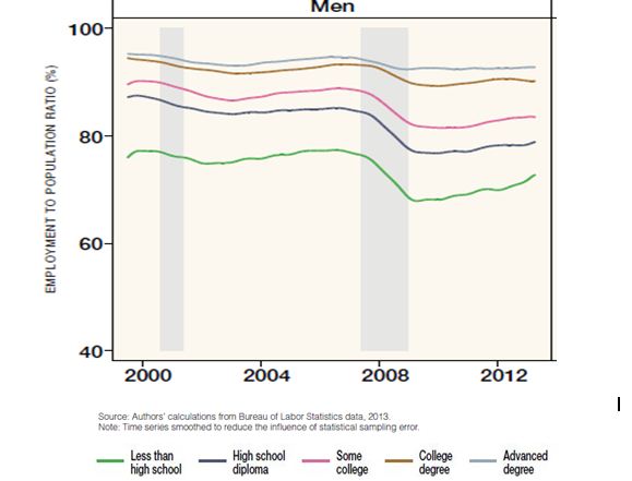
Prime Age Employment
The graph indicates what percent of men, in United States, attained prime age employment, having different educational qualifications; less than high school, high school diploma, some college, college degree or advanced degree.
Between 2000 and 2012 percentage of men doing prime age employment, changed to some extent, in all five categories, but the most marked change was in men having high school diploma or some college degree. At the beginning of the period the proportion of such men employed in prime age was slightly lower than the ones with college or advanced degree. However, by 2012 this figure had
declined to nearly 80 percent.
The other category wherein the percentage of employment fell over the period was ,less than high school. However, the changes here were much less dramatic. Proportion of men involved in prime age employment remained nearly steady till 2008 when it dipped by few percent; observing a significant increase after 2008.
In two categories, college and advanced degree, the proportion of men employed remained steady, indicating a slight decline during 2008, after which it remained nearly constant. Thus, by the end of period, the highest proportion of men in prime age employment had advanced degree, and the lowest proportion had less than high school.
In conclusion, the graph shows that the patterns of employment in United States changed to some extent over the period of 2002 to 2012, the ones with high school diploma or some college showing the most marked change.
IELTSBAND7