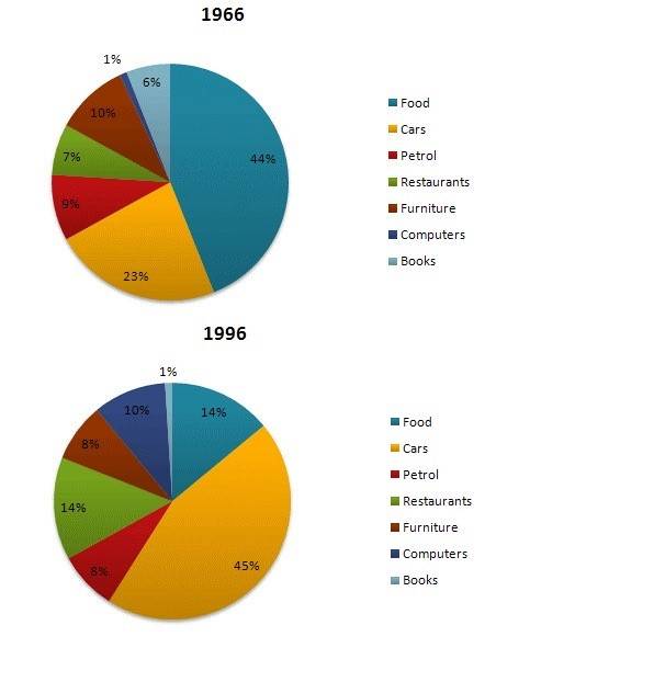
The given pie charts compare the consumer spending on 7 different categories in 1966 and 1996 in the U.S.A.
Academic Writing Task-1
Question: The given pie charts compare the expenses in 7 different categories in 1966 and 1996 by American Citizens.
Write a report for a university lecturer describing the information below.
Write at least 150 words.

Sample Answer:
The presented pie charts depict how much proportion of money U.S.A natives had spent on seven distinct categories in two specific years 1966 and 1996.
Looking from an overall perspective, it is readily apparent that food sector was leading in the beginning of the period, whilst cars segment overtook the position after 30 years of time span.
Looking at the details, in 1966, food was the most popular category amid Americans, constituting more than two-fifths of their spending (44%). Almost half of this percentage, customers allocated on cars, making it the second highest on list. In contrast, the lowest expenditure U.S residents made was on computers, accounting at just 1%. Expenses by them on furniture and petrol were nearly one-tenth each. Books and restaurants spending stood at 6% and 7% respectively.
Moving further, after 3 decades, food sector experienced/ underwent a steep decline and amounted to 14%, whereas expenditure on cars rose substantially from 23% to 45%. Interestingly, budget for books dropped to only 1%, while the computer segment had risen dramatically to 10%. Notably, restaurants spending percentage doubled from 7% to 14%. Lastly, the figure for furniture and petrol fell down to 8%. (194 Words)
Feel free to call for suggestions and queries.
67Near Ballupur Chowk, Dehradun
email: info at ieltsband7.com
IELTS BAND 7 Saharanpur
Parsvnath Plaza, Saharanpur
email: info@ieltsband7.com
