IELTS WRITING TASK 1 Graph # Leisure activities by males and females in the USA
IELTS WRITING TASK 1 Graph # Leisure activities by males and females in the USA
You should spend about 20 minutes on this task.
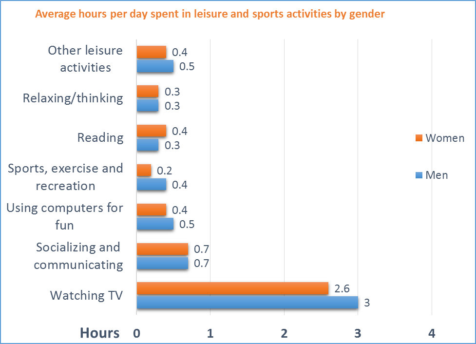
The bar chart below provides information about the time spent in leisure activities by males and females in the USA in 2014.
Summarise the information by selecting and reporting the main features, and make comparisons where relevant.
Write at least 150 words.
leisure activities by males and females in the USA
Sample Answer:
The bar graph compares the amount of time men and women expended every day in different leisure and sports activities in America in 2014.
One striking feature of the chart is that watching TV was the favorite free time activity for both the genders. On average, males spent 3 hours daily in front of their TV sets while women spent 2.6 hours. Socializing and interacting with family and friends was the next most preferred form of recreation. Both men and women spent 0.7 hours per day on this activity.
Leisure activities, sports, exercise and using electronic devices like computers were more popular among males. On the other hand, the opposite was true for reading as females expended 0.4 hours daily on this activity whereas men spent merely 0.3 hours. Interestingly, thinking or relaxing were equally popular among both sexes. This form of entertainment accounted for 0.3 hours daily for both men and women.
Overall, there were minor differences in the amounts of times males and females spent in different leisure and sport activities but watching TV was the activity which occupied the most time. (184 Words.)
Feel free to call for suggestions and queries.
![]()
IELTS Band 7 Dehradun
Near Ballupur Chowk, Dehradun
email: info at ieltsband7.com