IELTS ACADEMIC WRITING TASK 1 BAR GRAPH

IELTS ACADEMIC WRITING TASK 1
You should spend about 20 minutes on this task.
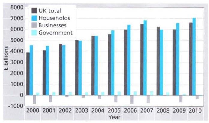
The bar graph below shows the net worth of the UK from 2000 to 2010 according to three sectors.
Summarise the information by selecting and reporting the main features, and make comparisons where relevant.
Write at least 150 words.


IELTS BAND 7 GRAPH


ANSWER:

The bar chart highlights the variation in the total wealth of the UK according to three different sectors over a decade (2000 -2010).
Between 2000 and 2002, the UK household net wealth remained fairly stable at about £4,500. The figures for both households and government sectors rose consistently in the following years until the economic downturn in 2008. In that year, the net worth of UK households dropped to about £6,000 billion, a significant decrease of approximately £800 billion compared with 2007. Interestingly, UK households wealth recovered in the next two years but the government’s net worth went into negative figures in 2010. It is important to note that throughout the given period the government’s wealth was comparatively much lower than that of the households.
Looking at the total wealth of the UK between 2000 and 2010, the figures were on a par with that of UK households. In six of the ten years represented in the chart, UK households were worth approximately 5% to 10% more than the UK total. For just under a third of this period, in the years 2002 to 2004, the UK total was equal to or greater than the total worth of UK households. Although, the net worth of business in the country improved from 2000 to 2002, this trend did not last and began to worsen again only a year later. From 2005 to 2007, although the rest of the country experienced continued growth, the wealth of business returned to the 2000 levels.
Overall, the total wealth of UK households and the government sector followed an upward trend in the given time period except in 2008. Surprisingly, the business sector remained the least growing section of the UK economy.

Identify Decreasing Trends in IELTS Task 1

How to Identify Decreasing Trends in IELTS Task 1
decrease IELTS Band 7 Dehradun

Related Vocabulary

Declined to
Decreased to
Dropped to
Fell to
Dipped to
Reduced to
Went down to
Slumped to
Plummeted to
Hit the minimum


Example:

In 2000, the school A had 80 students. In the next three years, the number of children declined rapidly to 50 and hit the minimum of 20 in the year 2006. In comparison, there were more students in school B in 2000 but the figures dropped gradually in the following years before ending at about 80 pupils in 2006.

phone icon

IELTS Dehradun Uttarakhand Tel: 8439000086 , 8439000087

Increasing Trends in IELTS Task-1

Trends are the most important part of the IELTS exam. Trends can either be increasing or decreasing. Sometimes it even remains constant. It is essential for you to know how to describe trends in a better way. This time we bring you the best way in which you can explain increasing trends in IELTS writing.


Example:

 How to Identify Increasing Trends in IELTS Task-1 ?

IELTS Task1 Graph increase Dehradun
Increased to
Rose to
Climbed to
Went up to
Leapt to
Boomed to
Soared to
Rocketed to
Surged to
Hit the mark of

Touched the mark of

Hit the maximum

In 2000, there were 70 children in school A. The number of students increased gradually to about 85 in the next six years. In comparison, school B had only 10 students in the year 2000 but the figures increased rapidly in the following years and hit the mark of 70 pupils in 2006.

Changes in British living standards # Table Academic Task 1

Academic Task 1:

You should spend about 20 minutes on this task.
The table below shows the consumer durables (television, computer, etc.) owned in Britain from 1972 to 1998.
Write a report for a university lecturer describing the information shown below.
You should write at least 150 words.


Consumer durables 1972 1975 1981 1985 1991 1993 1995 1996 1998
Percentage of households with:  % % % % % % % % %
Color TV 93 96 74 86 95 95 97 97 98
Home computer .. .. .. 13 21 24 25 27 34
Washing Machine 66 71 78 81 87 88 90 90 92
Telephone 42 54 75 81 88 90 93 94 96
Central Heating 37 43 59 69 82 83 86 88 90
Car or van 52 56 69 62 67 68 71 70 72

 Source: Office for National Statistics, UK

ANSWER:

The table provides information about how the number of British households with a range of consumer durables and household amenities has changed over a 26-year period between 1972 and 1998.
In 1972, the vast majority of households (93%) had a color television. In the next three years, figures touched the mark of 96%, but dropped to their lowest of about three quarters (74%) in the early 1980s. The percentage has steadily risen since then and almost all households (98%) had this mode of entertainment in 1998.
Looking at other products, it is clearly evident that there was a gradual rise in the ownership of all of them. The greatest increase was observed for central heating as the number of houses equipped with this facility rose from 37% in 1972 to 90% in 1998. Next came telephone ownership, rising from under a half (42%) of households in 1972 to 96% in 1998. The percentage of households with a washing machine went up by 26% over the same period and of those with a car or van rose by 20%. In 1985, the introduction year of home computers, just over one in eight British households (13%) owned a home computer. Interestingly, by the end of the period, numbers had climbed to 34%.
Overall, the percentage of British houses endowed with long-lasting goods and facilities increased throughout the given period.
WHO ARE WE?

phone icon
8439000086
8439000087
7055710002
7055710003

1 4 5 6 7 8 10