IELTS Graph # International money market

IELTS WRITING TASK 1 Graph

International money market
You should spend about 20 minutes on this task.
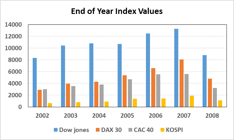
The chart shows the end of year value for four major international money market indices from 2002 to 2008. [Dow Jones = US Market Index, DAX 30 = German Market Index, CAC 40 = French Market Index, KOSPI = Korean Market Index]
Summarise the information by selecting and reporting the main features, and make comparisons where relevant.
Write at least 150 words.

IELTS Graph # International money market IELTS Band 7 Dehradun

Sample Answer

The bar chart provides information about the variation in the end of year values of four main international market indices over a period of eight years between 2002 and 2008.
Looking at the details, the American index was the strongest in each of the eight years. In comparison, the values of other three indices were considerably less than that of USA. Starting off at just over 8000 points in 2002, the US index reached its peak value of around 13000 points in 2007, before dropping off to its lowest level at nearly 9000 points in 2008.
The German market index was the second most valuable throughout the given period, peaking in 2007 at about 8000 points before witnessing a 3000 point drop in value by the end of 2008. There was a tight correlation in the value and performance of German and French markets. The value of French market index was less than that of the German index in each of the years except 2002. Even though the Korean market index had a similar performance trend, its value was the lowest.
Overall, what stands out from the data is that all four of the market indices rose steadily in value during 2002-2007, but there was a sharp drop in their values in 2008. Notably, Dow Jones, the American market index, was the highest valued index throughout the period in question whereas KOSPI, the Korean market index, was the lowest valued index.


phone icon

IELTS Dehradun Uttarakhand Tel: 8439000086 , 8439000087

IELTS BAND 7

IELTS Writing Task1 # Students at UK Universities

IELTS WRITING TASK 1

You should spend about 20 minutes on this task.
The tables below show the distribution of students at UK universities by mode of study and gender.
Summarise the information by selecting and reporting the main features, and make comparisons where relevant.

Male Postgraduate Students
Mode of study 1996/97 2000/01 2005/06 2009/10
Full-time 75,370 87,070 1,15,550 1,51,275
Part-time 1,13,961 1,08,770 1,38,505 1,17,105


Female Postgraduate Students
Mode of study 1996/97 2000/01 2005/06 2009/10
Full-time 62,344 85,215 1,18,675 1,46,980
Part-time 1,08,702 1,25,855 1,72,640 1,63,340

Sample Answer:

The tables compare the proportion of males and females enrolled in full-time and part-time postgraduate courses at UK universities in four academic sessions between 1996 and 2010.

It is evident that student enrolments in full-time courses followed an upward trend for both the genders throughout the given period. The number of males rose from 75,370 in 1996-97 to 151,275 in 2009-10 while that of females increased from 62,344 to nearly 146,980 during this period. These figures also indicate that there was a gender disparity in full-time postgraduate programmes. In 1996/96, the gender disparity was the highest (75,370 males versus 62,344 females) but the distribution became more balanced in the following years.

Focusing on part-time courses, overall more students were registered in these programmes as compared to full-time ones. In 1996-97, about 114,000 males and about 109,000 females selected part-time courses. In the next two academic years, there was a rapid increase in the percentage of female students whereas the number of male entrants fluctuated. The year 2005-06 had the highest enrolment rate in part-time programmes for both sexes, 138,505 males and 172,640 females. Notably, the number of students dropped in 2009-10.

In general, it can be concluded that full-time courses were more popular among males than females during the given period. The trend for part-time courses, on the other hand, was the opposite.

(227 Words)


Students at UK Universities

IELTS Dehradun Uttarakhand Tel: 8439000086 , 8439000087

IELTS Writing Task1: Police Officers and Criminals in Two Cities

Recent IELTS Writing Task 1

You should spend about 20 minutes on this task.

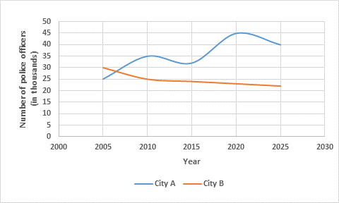
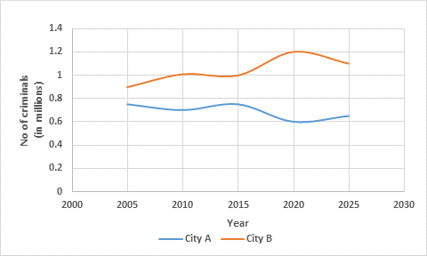
The line graphs below show the number of police officers and criminals in two cities since 2005 and predicted figures up until 2025.

Summarise the information by selecting and reporting the main features, and make comparisons where relevant.

Write at least 150 words.


IELTS Band7 Writing Task 1 Police officers in two cities since 2005 and predicted figures up until 2025

Police officers in two cities since 2005 and predicted figures up until 2025


IELTS Band7 Writing Task 1 criminals in two cities since 2005 and predicted figures up until 2025

Criminals in two cities since 2005 and predicted figures up until 2025


Sample Answer:

The line graphs illustrate the variation in the proportion of police officers and offenders in two cities, city A and city B, over a period of two decades between 2005 and 2025.
In 2005, city A had 25000 police officials whereas the number of officers in city B was comparatively higher, 30000. In the next 5 years, city A experienced a significant rise of 10,000 in the proportion of its police officers. In contrast, the trend for city B was downward and the numbers dropped to 25000 in 2010. Between 2010 and the present, city A’s police figures fluctuated while that of city B decreased slightly. According to future predictions, the number of police officers in city A will reach the mark of 45,000 in 2020. These figures are expected to decline to 40,000 in 2025. In comparison, city B will have only about 22,000 police officers between the present and 2025.
According to the second line graph, the number of criminals in city A and city B stood at nearly 0.9 million and 0.7 million respectively in 2005. In the next decade, city A’s figures dropped slightly while that of city B rose gradually to 1 million. In the future, city A will have about 0.6 million offenders. In contrast, the numbers in city B will be significantly higher, in the range of 1.1 to 1.2 million.
Overall, the number of police officers in city A has increased since 2005 while that of criminals has dropped. But, the trend for city B has been the reverse during this period i.e. fewer police officers and more criminals. (267 Words)


IELTS BAND 7

IELTS ACADEMIC WRITING TASK 1 BAR GRAPH

IELTS ACADEMIC WRITING TASK 1
You should spend about 20 minutes on this task.
The bar graph below shows the net worth of the UK from 2000 to 2010 according to three sectors.
Summarise the information by selecting and reporting the main features, and make comparisons where relevant.
Write at least 150 words.


IELTS BAND 7 GRAPH


ANSWER:

The bar chart highlights the variation in the total wealth of the UK according to three different sectors over a decade (2000 -2010).
Between 2000 and 2002, the UK household net wealth remained fairly stable at about £4,500. The figures for both households and government sectors rose consistently in the following years until the economic downturn in 2008. In that year, the net worth of UK households dropped to about £6,000 billion, a significant decrease of approximately £800 billion compared with 2007. Interestingly, UK households wealth recovered in the next two years but the government’s net worth went into negative figures in 2010. It is important to note that throughout the given period the government’s wealth was comparatively much lower than that of the households.
Looking at the total wealth of the UK between 2000 and 2010, the figures were on a par with that of UK households. In six of the ten years represented in the chart, UK households were worth approximately 5% to 10% more than the UK total. For just under a third of this period, in the years 2002 to 2004, the UK total was equal to or greater than the total worth of UK households. Although, the net worth of business in the country improved from 2000 to 2002, this trend did not last and began to worsen again only a year later. From 2005 to 2007, although the rest of the country experienced continued growth, the wealth of business returned to the 2000 levels.
Overall, the total wealth of UK households and the government sector followed an upward trend in the given time period except in 2008. Surprisingly, the business sector remained the least growing section of the UK economy.

1 3 4 5 6 7 9