
Percentage Of Poverty-1 # Bar Graph
You should spend about 20 minutes on this task.
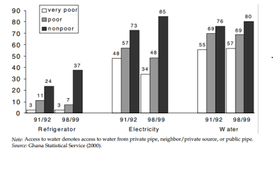
The graph below shows the percentage of households, grouped by poverty, on the basis of access to refrigerator, electricity and water in Ghana for the year 1991/1992 to 1998/1999.
Summarize the information by selecting and reporting the main features and make comparisons where relevant.
Write at least 150 words.
Bar Graph
The graph illustrates the level of poverty amongst households in Ghana over a period of seven years i.e. from 1991/92 to 1998/99, grouped according to the access of refrigerator, electricity and water.
Initially, most of the houses having access to electricity and water were non-poor with the percentage being 73% and 76% respectively whereas refrigerator did not have much effect on financial condition of household with only 24% of households being non-poor. In addition, 11%, 57% and 69% of households living under poor conditions had access to refrigerator, electricity and water respectively. However, 48% of households with availability of electricity were in very poor situations while 3% and 55% with refrigerator and water found themselves categorized as very poor.
Over a period of seven years, the number of households categorized as non-poor accessing refrigerator, electricity and water substantially increased to 37%, 85% and 80% respectively. Although the percentage of very poor remained constant in case of refrigerator, it declined to 34% in case of electricity and showed a minor increment with regards to water. Similar observations were seen in case of poor households.
Overall, the availability of electricity and water remained major factors in determining the financial status of households, however access to refrigerator did not make any major impact.
EXPLANATION
The answer provided is of band 6 and there are reasons for it.
- There is no clarity in the answer. After reading it, one cannot make out what the graph is about and what are the major issues. This is the major flaw. When answering a question of graph, it is expected that on reading it, you can get a clear summary of graph.
- In the second paragraph, the use of initially is not correct. It is expected that you mention the year clearly.
- Repetition of words has been observed in many cases, this is not a good idea.
So, how to answer such graphs.
Rather than going from one point to another again and again, it is better you take a point and explain it better. All the trends observed in that particular point.
Be more clear about the year and it is better if you don’t use words such as initially or later on.
IELTSBAND7
I believe this is among the most important info for me. And i’m satisfied reading your article. But want to commentary on some normal things, The site style is ideal, the articles is actually excellent : D. Excellent process, cheers|