Overweight Adults Population Graph

IELTS ACADEMIC WRITING TASK 1 # Overweight Adults Population Graph

You should spend about 20 minutes on this task.
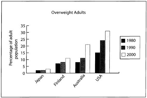
The chart below gives Information about the percentage of the adult population who were overweight in four different countries in 1980, 1990 and 2000.
Summarise the information by selecting and reporting the main features, and make comparisons where relevant.
Write at least 150 words.
overweight adults ielts Dehradun

overweight adults ielts Dehradun

The bar chart illustrates the variation in the proportion of obese adults in four different regions in 1980, 1990 and 2000.
One striking feature of the chart is that Japan had the lowest proportion of corpulent people in all three given years. Figures stood at about two percent in the 80s and 90s and rose by only one percent in 2000, indicating that the degree of change was the smallest in Japan.
Looking at Finland and Australia, around six percent Finnish and Australians were overweight in 1980. By the end of the period, the proportion of obese Finnish had almost doubled while that of Australians nearly tripled, reaching approximately 20%. This shows that the rate of increase in Australia was much higher than Finland.
Focusing on the distribution of overweight adults in America, it is clear that the USA had the highest percentage of obese people in each of the given years. The percentage rose from 15% in 1980 to a whopping 30% in 2000.
Overall, it can be concluded that the population of corpulent adults increased in all four countries, but the scale of problem and the rate of rise was greater in Australia and America.

Changes in British living standards # Table Academic Task 1

Academic Task 1:

You should spend about 20 minutes on this task.
The table below shows the consumer durables (television, computer, etc.) owned in Britain from 1972 to 1998.
Write a report for a university lecturer describing the information shown below.
You should write at least 150 words.


Consumer durables 1972 1975 1981 1985 1991 1993 1995 1996 1998
Percentage of households with:  % % % % % % % % %
Color TV 93 96 74 86 95 95 97 97 98
Home computer .. .. .. 13 21 24 25 27 34
Washing Machine 66 71 78 81 87 88 90 90 92
Telephone 42 54 75 81 88 90 93 94 96
Central Heating 37 43 59 69 82 83 86 88 90
Car or van 52 56 69 62 67 68 71 70 72

 Source: Office for National Statistics, UK

ANSWER:

The table provides information about how the number of British households with a range of consumer durables and household amenities has changed over a 26-year period between 1972 and 1998.
In 1972, the vast majority of households (93%) had a color television. In the next three years, figures touched the mark of 96%, but dropped to their lowest of about three quarters (74%) in the early 1980s. The percentage has steadily risen since then and almost all households (98%) had this mode of entertainment in 1998.
Looking at other products, it is clearly evident that there was a gradual rise in the ownership of all of them. The greatest increase was observed for central heating as the number of houses equipped with this facility rose from 37% in 1972 to 90% in 1998. Next came telephone ownership, rising from under a half (42%) of households in 1972 to 96% in 1998. The percentage of households with a washing machine went up by 26% over the same period and of those with a car or van rose by 20%. In 1985, the introduction year of home computers, just over one in eight British households (13%) owned a home computer. Interestingly, by the end of the period, numbers had climbed to 34%.
Overall, the percentage of British houses endowed with long-lasting goods and facilities increased throughout the given period.
WHO ARE WE?

phone icon
8439000086
8439000087
7055710002
7055710003

Recommend a driving school # IELTS letter

WRITING TASK 1
You should spend about 20 minutes on this task.
Your friend is thinking about learning to derive and would like some advice,

Write a letter to your friend. In your letter

  • Say why a driving license is advantageous
  • Recommend a driving school
  • Give any extra guidance/tips

ANSWER (Band 7.5 Level):
Dear Rebecca,

I would like to appreciate your decision of learning to drive. There will be a whole new start of your life after that.
If I start up with the paybacks of having a driving license, the list will go endless. The first and foremost thing is that you will feel self-dependent this way. Neither you will feel restricted nor the oddities of public transport will bother you. Moreover, you can save your precious time.
As you have asked about a driving school, here is one I would like to suggest. Success Driving School will be my first advice as this is recognized as one of the most renowned driving school in New Delhi. They have a well organized training program and flexible timings. More importantly, their trainers are truly professional. You will get the best out of your bucks.
Firstly, for theoretical exam, it would be a great idea to purchase a traffic rule guide published by City Traffic Control Police. Secondly, I would advice you to keep a first aid box handy. I hope you will give your best in this training. As the saying goes, “practice makes a man perfect” I am sure after a few months, you will start driving confidently. Looking forward for a win over news.

Love,

Sussain

Annual Spending of the Indian Rail Industry # Pie Chart

Question Writing task 1

You should spend about 20 minutes on this task.
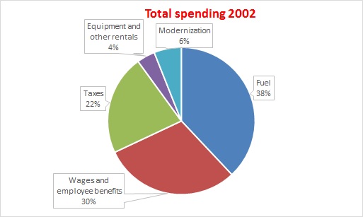
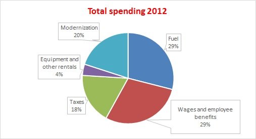
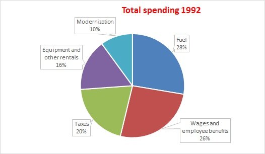
The three pie charts show the annual spending of the Indian rail industry in 1992, 2002 and 2012.


IELTS Dehradun topic: Annual spending of the Indian rail industry

The pie charts illustrate the variation in the running costs of the Indian railway in three separate year 2002.


IELTS Dehradun The pie charts illustrate the variation in the running costs of the Indian railway in three separate year 2012.

Answer: (Level band 8.5)

The pie charts illustrate the variation in the running costs of the Indian railway in three separate years 1992, 2002 and 2012.

In all three years, the greatest expenditure was on fuel and workers’ salaries including benefits. Fuel spending increased dramatically from 28% in 1992 to 38% in 2002 but the expenses reduced to their nominal value of 29% in 2012. Approximately, employees wages and benefits used the same proportion, 26-30%.

In the year 1992, one fifth of the annual budget went towards taxes and slightly less, 16%, was spent on resources such as equipment and rentals. Surprisingly, the smallest fraction, 10%, was expended on the modernization of railways in this year. In the next two decades, there were small fluctuations of the order of two percent in the expenditure on taxes. Comparitively, the budget for equipment saw a downward trend, ending at only four percent of the total in 2012. In a sharp contrast, the spending on railway development experienced a rising trend, growing from only 6% in 2002 to a whooping 20% by 2012.

Overall, staff salaries and fuel constituted the largest cost to the Indian railway, and while figures fluctuated for most categories, the modernization expenditure went up significantly.

phone icon
8439000086
8439000087
7055710002
7055710003


1 61 62 63 64 65 72