
Graph # Population aged 65 and over between 1940 and 2040
IETLS Writing Task 1 # Graph
You should spend about 20 minutes on this task.
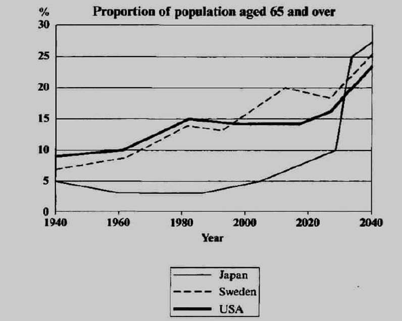
The line graph below shows the proportion of the population aged 65 and over between 1940 and 2040 in three different countries.
Summarise the information by selecting and reporting the main features, and make comparisons where relevant.
Write at least 150 words.
Source: adapted from Cambridge IELTS 5
Sample Answer
The line graph illustrates the variations in the percentage of old people aged 65 and above in Japan, Sweden and USA over a 100-year period from 1940 to 2040.
In 1940, just under ten percent of the US population was 65 and over, the highest figure among the listed countries. Sweden and Japan stood at the second and third place respectively with nearly 7% and 5% population in this age range. In the next 50 years (i.e. 1940-1990), the curves followed strikingly similar upward trends in western countries. The proportion of elderly in the USA reached the mark of 15% whereas the percentage was slightly less than 15% in Sweden. In comparison, there was a small decrease of about 2% in the Japanese figures during this period.
Between 1990 and the present, the American figures remained constant while Sweden and Japan experienced a gradual increase in their percentages. Notably, these proportions are expected to rise dramatically in the next two decades in all the three countries. By 2040, the ageing population will account for nearly one fourth of the total population in these nations.
Overall, it is evident that the proportion of elderly people has risen in all the given countries. This trend is predicted to continue in the future and by 2040, these countries will have a similar number of old people (about 25%). (225 Words)
Feel free to call for suggestions and queries.
![]()
IELTS Band 7 Dehradun
Near Ballupur Chowk, Dehradun
email: info at ieltsband7.com