IELTS ACADEMIC WRITING TASK 1 BAR GRAPH
IELTS ACADEMIC WRITING TASK 1
You should spend about 20 minutes on this task.
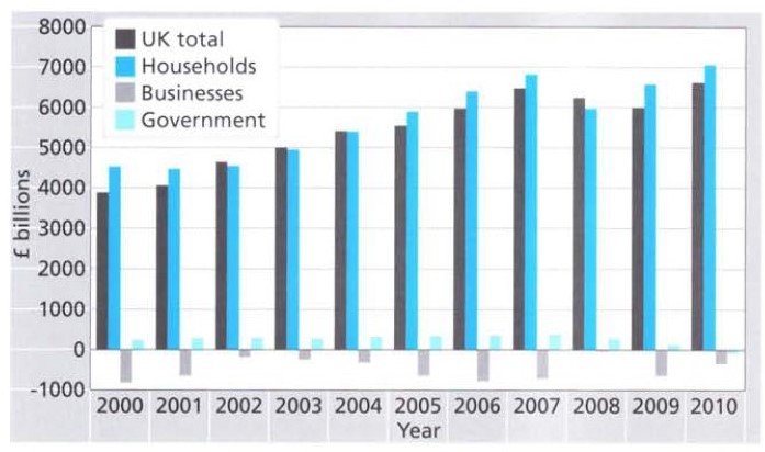
The bar graph below shows the net worth of the UK from 2000 to 2010 according to three sectors.
Summarise the information by selecting and reporting the main features, and make comparisons where relevant.
Write at least 150 words.

ANSWER:
The bar chart highlights the variation in the total wealth of the UK according to three different sectors over a decade (2000 -2010).
Between 2000 and 2002, the UK household net wealth remained fairly stable at about £4,500. The figures for both households and government sectors rose consistently in the following years until the economic downturn in 2008. In that year, the net worth of UK households dropped to about £6,000 billion, a significant decrease of approximately £800 billion compared with 2007. Interestingly, UK households wealth recovered in the next two years but the government’s net worth went into negative figures in 2010. It is important to note that throughout the given period the government’s wealth was comparatively much lower than that of the households.
Looking at the total wealth of the UK between 2000 and 2010, the figures were on a par with that of UK households. In six of the ten years represented in the chart, UK households were worth approximately 5% to 10% more than the UK total. For just under a third of this period, in the years 2002 to 2004, the UK total was equal to or greater than the total worth of UK households. Although, the net worth of business in the country improved from 2000 to 2002, this trend did not last and began to worsen again only a year later. From 2005 to 2007, although the rest of the country experienced continued growth, the wealth of business returned to the 2000 levels.
Overall, the total wealth of UK households and the government sector followed an upward trend in the given time period except in 2008. Surprisingly, the business sector remained the least growing section of the UK economy.


