Bakery Sales # Graphs For IELTS
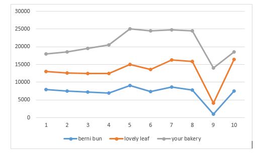
The graph shows data about the annual sales of three factories in London, 2001-2010.
Summarise the information by selecting and reporting the main features, make comparisons where relevant.
The graph illustrates the number of products sold by three factories (Berni Bun, Lovely Leaf and Your Bakery) over the period of nine years i.e. from 2001 to 2010. Units are measured in euros.
Overall, the factories showed an increase during the year 2004 while the sales dipped down in 2009. Your bakery remained the highest selling bakery over the entire period while berni bun sold the least number of bakery items.
For the initial years, from 2001 to 2004, your bakery marked a steady growth while Berni bun and lovely leaf dipped down, marking a slight difference in their sale. However, an increase of approximately 5000, 3000 and 2000 was observed in the sales of your bakery, lovely leaf and berni bun respectively from 2004-2005.
During 2005-2008, the sales in your bakery remained steady while fluctuations were observed in lovely leaf and berni bun. The sales then slumped for all the three factories in 2008-2009, marking an upward trend from 2009-2010.

