WRITING TASK 1: The proportion of males and females in India.

WRITING TASK 1

You should spend about 20 minutes on this task.

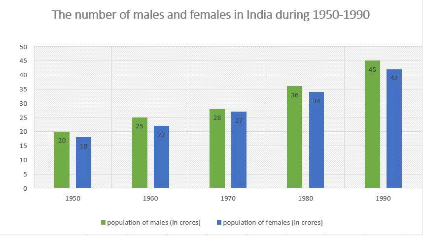
The bar graph below shows the proportion of males and females in India during 1950-1990.

Summarise the information by selecting and reporting the main features, and make comparisons where relevant.


proportion-of-male-and-female Best IELTS Band 7 coaching in dehradun

Sample Answer

The given bar graph illustrates the number of males and females in India from 1950 to 1990. Over the period of 40 years, the total number of population has drastically increased.

As we can see from the data,the population of females was greater in 1960 than in 1950, whereas, the population of males was higher in 1990 than in 1980. Before 1970,the population of females was higher than the male population,whereas, the population of both males and females has reached at par in 1970. Thereafter, the population of males has started increasing at an increasing rate and reached at a level of 36 crores in 1980.Additionally, As per the records, the population of India has doubled over 40 years.

From 1950 until 1990, the graph suggests that the sex ratio in India has considerably declined due to different reasons.It is also clear that, initially the female population in India was higher than the male population, which had completely reversed during the given period.

phone icon

IELTS Dehradun Uttarakhand Tel: 8439000086 , 8439000087


Writing Task 1: Indian Retail Industry

Pie chart is a type of graph in which a circle is divided into sectors that each represent a proportion of the whole. These charts are best preferred when comparing different sub-categories or to represent the whole of the entire situation. This time let us have a look at a sample answer that compares two pie charts and summarizes the information required.

WRITING TASK 1

You should spend about 20 minutes on this task.

The pie charts below show the distribution of the market share of different segments in Indian Retail Industry from 2010 to 2015.

Summarise the information by selecting and reporting the main features, and make comparisons where relevant.
INDIAN RETAIL INDUSTRY

Best Coaching IELTS BAND 7 in Dehradun INDIAN RETAIL INDUSTRY

Sample Answer

The two pie charts compare the distribution of segments in the Indian retail sector during 2010 and 2015.

The significant segments for the retail sector in India were clothing and textile comprising  approximately 40% of the total market share. Whereas footwear and other sectors were the minor contributors in the Indian retail industry.

As we can see, clothing and textile consisted of 37% in the first year and showed an insignificant increase of only 3% in 2015. On the contrary, in 2010, the proportion of food and beverages fell marginally to 18% in 10 years.

With reference to the market share of the other two constituents of retail industry,there was an approximate 4% growth in consumer durable whereas, footwear segment rose by 2%  in 2015.On the other side, the market share of other segments declined by 5% in 2015,by 17%v to 12%.

(156 words)

phone icon

IELTS Dehradun Uttarakhand Tel: 8439000086 , 8439000087


IELTS WRITING TASK 1# Academic Staff Graph

IELTS WRITING TASK 1

You should spend about 20 minutes on this task.
The bar graph shows the percentage of male and female academic staff members in different faculties of a particular university in 2008.
Summarise the information by selecting and reporting the main features, and make comparisons where relevant.
Write at least 150 words.

Sample Answer

The bar graph provides information about the gender distribution of teachers in seven different departments of a university in 2008.
One striking feature of the chart is that there was a large gender disparity in some faculties. Engineering had the highest percentage of male academics whereas the faculty of history was dominated by female academics. Notably, there were approximately 90% male and 10% female teachers in the faculty of engineering. In history, nearly three quarters of the academic staff were women compared to approximately 30% men.

Other faculties, on the other hand, had a more balanced composition. In medicine, men and women were almost equally represented, while in arts slightly more than half of the teachers were female. Interestingly, astronomy and science were the only two faculties which had the same proportions of both the genders, 65% males versus 35% females. In law, the percentage of female academics was 5% higher than that in astronomy and science.

Overall, the chart shows that at this university, the faculties of engineering, astronomy and science were male-dominated; however, women had a significant presence in fields related to arts, history and medicine. (190 Words)


IELTS BAND 7

Contact us at –

IELTS Dehradun Uttarakhand Tel: 8439000086

IELTS ACADEMIC WRITING TASK 1 BAR GRAPH

IELTS ACADEMIC WRITING TASK 1
You should spend about 20 minutes on this task.
The bar graph below shows the net worth of the UK from 2000 to 2010 according to three sectors.
Summarise the information by selecting and reporting the main features, and make comparisons where relevant.
Write at least 150 words.


IELTS BAND 7 GRAPH


ANSWER:

The bar chart highlights the variation in the total wealth of the UK according to three different sectors over a decade (2000 -2010).
Between 2000 and 2002, the UK household net wealth remained fairly stable at about £4,500. The figures for both households and government sectors rose consistently in the following years until the economic downturn in 2008. In that year, the net worth of UK households dropped to about £6,000 billion, a significant decrease of approximately £800 billion compared with 2007. Interestingly, UK households wealth recovered in the next two years but the government’s net worth went into negative figures in 2010. It is important to note that throughout the given period the government’s wealth was comparatively much lower than that of the households.
Looking at the total wealth of the UK between 2000 and 2010, the figures were on a par with that of UK households. In six of the ten years represented in the chart, UK households were worth approximately 5% to 10% more than the UK total. For just under a third of this period, in the years 2002 to 2004, the UK total was equal to or greater than the total worth of UK households. Although, the net worth of business in the country improved from 2000 to 2002, this trend did not last and began to worsen again only a year later. From 2005 to 2007, although the rest of the country experienced continued growth, the wealth of business returned to the 2000 levels.
Overall, the total wealth of UK households and the government sector followed an upward trend in the given time period except in 2008. Surprisingly, the business sector remained the least growing section of the UK economy.

1 2 3 4 5