IELTS Academic Writing task 1: Production and consumption of potatoes in 2006

WRITING TASK 1 : IELTS Academic Writing task 1: Production and consumption of potatoes in 2006

You should spend about 20 minutes on this task.

The tables below provide information about the consumption and production of potatoes in five parts of the world in 2006. ­­

Summarise the information by selecting and reporting the main features, and make comparisons where relevant.

Write at least 150 words.

Consumption of potatoes (kg per person)
South and Central America 23.6
Africa 14.1
North America 57.9
Europe 96.1
Asia 25.8


Production of potatoes (in million tonnes)
South and Central America 15.6
Africa 16.4
North America 24.7
Europe 126.3
Asia 131.2
Sample Answer

The tables give data regarding the quantity of potatoes consumed per person (in kg) and grown (in million tonnes) in five regions in 2006.

Looking at the regional consumption, Europe was the biggest consumer with 96.1 kg potatoes eaten per person. It was followed by North America where per capita potato usage was comparatively less, only 57.8 kg. At the next levels i.e. the third and fourth, were Asia and South and Central America.  These areas had similar levels of consumption, 25.8 and 23.6 kg respectively. In comparison, an average person in Africa ate less than half this amount (14.1 kg) annually, making it the smallest consumer.

As regards the production, Asia and Europe were the two largest potato producers in 2006. Their production amounted to approximately 131 and 126 million tonnes respectively. North America stood at the third position. But, its contribution was only 24.7 million tonnes which is about one fifth of the European share. The other regions, South and Central America and Africa, were far behind Europe. Each of them produced around 16 million tonnes of potatoes, nearly one eighth the European proportion.

Overall, Asia and Europe were two primary potato producing regions whereas Europe and North America were the two largest consumers.


Feel free to call for suggestions and queries.

phone icon

8439000086

8439000087

7055710003

7055710004

IELTS Band 7 Dehradun
Near Ballupur Chowk, Dehradun

email: info at ieltsband7.com

IELTS online simulator

IELTS BAND 7 Home page

Graph # Population aged 65 and over between 1940 and 2040

IETLS Writing Task 1 # Graph

You should spend about 20 minutes on this task.
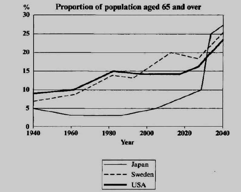
The line graph below shows the proportion of the population aged 65 and over between 1940 and 2040 in three different countries.
Summarise the information by selecting and reporting the main features, and make comparisons where relevant.
Write at least 150 words.

Graph

Source: adapted from Cambridge IELTS 5

Sample Answer

The line graph illustrates the variations in the percentage of old people aged 65 and above in Japan, Sweden and USA over a 100-year period from 1940 to 2040.
In 1940, just under ten percent of the US population was 65 and over, the highest figure among the listed countries. Sweden and Japan stood at the second and third place respectively with nearly 7% and 5% population in this age range. In the next 50 years (i.e. 1940-1990), the curves followed strikingly similar upward trends in western countries. The proportion of elderly in the USA reached the mark of 15% whereas the percentage was slightly less than 15% in Sweden. In comparison, there was a small decrease of about 2% in the Japanese figures during this period.

Between 1990 and the present, the American figures remained constant while Sweden and Japan experienced a gradual increase in their percentages. Notably, these proportions are expected to rise dramatically in the next two decades in all the three countries. By 2040, the ageing population will account for nearly one fourth of the total population in these nations.

Overall, it is evident that the proportion of elderly people has risen in all the given countries. This trend is predicted to continue in the future and by 2040, these countries will have a similar number of old people (about 25%). (225 Words)


Feel free to call for suggestions and queries.

phone icon

8439000086

8439000087

7055710003

7055710004

IELTS Band 7 Dehradun
Near Ballupur Chowk, Dehradun

email: info at ieltsband7.com
IELTS online simulator

IELTS BAND 7 Home page

IELTS Writing Task1 # Stone Axes

WRITING TASK 1
You should spend about 20 minutes on this task.
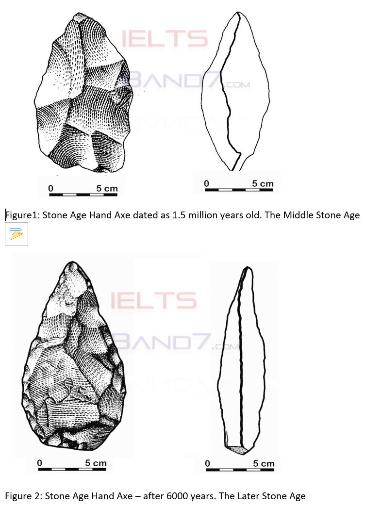
The diagrams below show stone hand axes from two different paleolithic periods.
Summarise the information by selecting and reporting the main features, and make comparisons where relevant.
Write at least 150 words.


stone IELTS band7

Sample Answer:

The diagrams compare the features of two paleolithic hand axes crafted by early humans in two separate periods of the stone age, the middle and the later. Two view points, face on and edge on, are given for each axe.
As it can be seen from the first figure, the middle stone age axe had an irregular leaf shape. Its length was approximately 6 cm and its base width was comparatively less, only about 3.5 cm. Its thickness was about 2.5 cm. The shape of the middle line in the edge on view suggests that one face was thicker than the other.
Focusing on the later stone age axe, changes in the shape and size of the tool are clearly visible. It had a more streamlined triangular shape with a broad base and a pointed tip. It was about 1.5 cm longer and 1 cm thinner than the middle stone age hand axe. Interestingly, the thickness of both faces was roughly the same.
Overall, the shapes of the stone hand axes were similar in both periods but the hand axe crafted in the later paleolithic period was relatively smoother and slimmer. (191 Words)


Feel free to call for suggestions and queries.

phone icon

8439000086

8439000087

7055710003

7055710004

IELTS Band 7 Dehradun
Near Ballupur Chowk, Dehradun

email: info at ieltsband7.com
IELTS online simulator

IELTS BAND 7 Home page

IELTS Writing Task 1 Graph # Honey Production

IELTS WRITING TASK 1
You should spend about 20 minutes on this task.
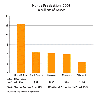
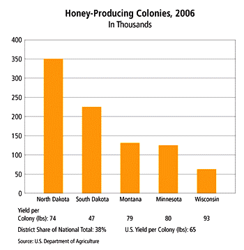
The bar charts below provide information about honey production and honey producing colonies in the five American states in 2006.
Summarise the information by selecting and reporting the main features, and make comparisons where relevant.
Write at least 150 words.

IELTS Band 7 Source: US Department of Agriculture

IELTS Band7 Source: US Department of Agriculture

Sample Answer:

The bar graphs represent the amount of honey produced and the number of bee colonies in five US states namely North Dakota, South Dakota, Montana, Minnesota and Wisconsin in 2006.
Looking at the first bar graph, the combined honey production of all the given states was approximately 62 million pounds. Notably, North Dakota’s contribution to the total was the highest while that of Wisconsin was the lowest, at just over 25 and 5 million pounds respectively. The other three states (South Dakota, Montana and Minnesota) collectively accounted for nearly 30 million pounds of honey. It is worthwhile to note that the amount of honey produced in these three regions was approximately equal, around 10 million pounds.
Focusing on the distribution of honey bee colonies, North Dakota stood at the top position with 350, 000 colonies. It was followed by South Dakota which had nearly 225, 000 colonies. Figures in Montana and Minnesota, on the other hand, were comparatively lower but they were very close to each other, about 125,000. As in the first chart, Wisconsin grabbed the last place with just over 50,000 colonies.
Overall, it is clearly evident that out of the five listed states, North Dakota was the biggest honey producer with maximum number of bee colonies. Interestingly, even though South Dakota had more colonies as compared to Montana and Minnesota, its production was not significantly different from them. (231 Words)


Feel free to call for suggestions and queries.

phone icon

8439000086

8439000087

7055710003

7055710004

IELTS Band 7 Dehradun
Near Ballupur Chowk, Dehradun

email: info at ieltsband7.com
IELTS online simulator

IELTS BAND 7 Home page

1 2 3 4 5 10