IELTS WRITING Task1 Chart # Schools Survey

IELTS WRITING TASK 1
You should spend about 20 minutes on this task.
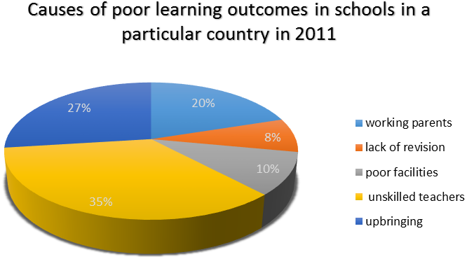
The pie chart below shows the results of a survey of the causes of poor learning outcomes in schools in a particular country in 2011.
Summarise the information by selecting and reporting the main features, and make comparisons where relevant.
Write at least 150 words.


IELTS-Band7 Dehradun

IELTS WRITING Task 1 Pie Chart # Schools Survey

Sample Answer

The pie chart highlights people’s views from a survey of the reasons behind poor academic outcomes in a country in 2011.

People attributed bad performance in schools to a number of causes. These included working parents, lack of revision, inadequate facilities, unskilled teachers and upbringing. Among all the five listed causes, unskilled teachers was cited by the maximum number of those surveyed at 35%. This was followed by the way a child is brought up, a cause quoted by 27% of the poll sample. Only one in five participants ascribed unsatisfactory school results to working parents. Lack of facilities and revision were considered by fewer respondents, 10% and 8% respectively.

In general, both school related and home environment related causes were held accountable for low educational attainment. Notably, total percentages of people who cited these factors were not significantly different, 53 percent versus 47 percent. However, it is clearly evident that most participants blamed untrained teachers for below average academic results.

(161 Words)


Feel free to call for suggestions and queries.

phone icon

8439000086

8439000087

7055710003

7055710004

IELTS Band 7 Dehradun
Near Ballupur Chowk, Dehradun

email: info at ieltsband7.com

IELTS online simulator

IELTS BAND 7 Home page

IELTS Graph – Club preferences by age range

IELTS WRITING TASK 1

You should spend about 20 minutes on this task.
The bar graph below represents the data about the clubs joined by the people of two different age groups at a leisure center.
Summarise the information by selecting and reporting the main features, and make comparisons where relevant.

IELTS Graph

Sample Answer:

(IELTS Lavel 8.5)
The bar graph compares the popularity of six activity clubs between two adult age groups at a particular leisure center.
OR
The bar graph provides information about how two age groups participate in six activity clubs at a particular leisure center.

One striking feature of the data is that the photography, fitness, and music/dance clubs are popular with both older and younger people. By Contrast, the cycling, arts and crafts, and gardening activities clearly appeal more to one of the age groups. The cycling club has the greatest number of 25-35 year-olds, but it is one of the least popular clubs with the older age group.

This trend is closely followed by the arts and crafts club which has 60 young members in comparison with only 20 from the 55-65 age bracket. In the gardening club, the pattern is reversed. There are about 55 members aged between 45 and 55 while the proportion of young participants is considerably lower. Notably, the composition of fitness and music/dance clubs is quite balanced, but there are slightly fewer older members. The membership of photography club stands at 45 for both groups.

In general, it can be concluded that some clubs attract both young and old people. Nonetheless, overall, the younger age group is significantly more involved in various activities than the 55-65 year-olds. (220 Words)


Feel free to call for suggestions and queries.

phone icon

8439000086

8439000087

7055710003

7055710004

IELTS Band 7 Dehradun
Near Ballupur Chowk, Dehradun

email: info at ieltsband7.com

IELTS online simulator

IELTS BAND 7 Home page

IELTS Graph # Deaths by Gender in Australia

IELTS Graph WRITING TASK 1

You should spend about 20 minutes on this task.

The bar graph below shows the leading causes of deaths by gender in Australia in 2014.

Summarise the information by selecting and reporting the main features, and make comparisons where relevant.

Write at least 150 words.


IELTS Graph deaths by gender in Australia

IELTS Graph deaths by gender in Australia


ANSWER:

The bar graph compares the proportion of males and females who died from various diseases in Australia in 2014.

It is clearly evident that ischaemic heart diseases were the biggest cause of death for both men and women in 2014, accounting for 11,082 and 9,091 deaths, respectively. Dementia including Alzheimer and cerebrovascular diseases were more prevalent among females than males. About 14000 women and slightly more than 8000 men died from them.

Looking at life threatening health problems among men, it is noticeable that trachea, bronchus and lung cancer and chronic lower respiratory diseases were two major killers. These illnesses took the lives of nearly 9000 men as compared to 7000 women.  Surprisingly, the mortality rate due to diabetes was approximately equal for both genders as figures stood at just over 2000 in both cases. Various types of cancers such as skin, blood, colon, breast and prostate etc. were also responsible for numerous deaths of both sexes in that year.

Overall, ischaemic cardiovascular problems contributed to the largest number of deaths in 2014.  Other major causes of deaths reflect a gender bias: mental disorders like dementia and Alzheimer killed more females whereas respiratory diseases led to the loss of lives of more males.


IELTS Band 7, 323, GMS Road, Dehradun, Uttarakhand 248001

phone icon
8439000086
8439000087
7055710002
7055710003

Graph # Population aged 65 and over between 1940 and 2040

IETLS Writing Task 1 # Graph

You should spend about 20 minutes on this task.
The line graph below shows the proportion of the population aged 65 and over between 1940 and 2040 in three different countries.
Summarise the information by selecting and reporting the main features, and make comparisons where relevant.
Write at least 150 words.

Graph

Source: adapted from Cambridge IELTS 5

Sample Answer

The line graph illustrates the variations in the percentage of old people aged 65 and above in Japan, Sweden and USA over a 100-year period from 1940 to 2040.
In 1940, just under ten percent of the US population was 65 and over, the highest figure among the listed countries. Sweden and Japan stood at the second and third place respectively with nearly 7% and 5% population in this age range. In the next 50 years (i.e. 1940-1990), the curves followed strikingly similar upward trends in western countries. The proportion of elderly in the USA reached the mark of 15% whereas the percentage was slightly less than 15% in Sweden. In comparison, there was a small decrease of about 2% in the Japanese figures during this period.

Between 1990 and the present, the American figures remained constant while Sweden and Japan experienced a gradual increase in their percentages. Notably, these proportions are expected to rise dramatically in the next two decades in all the three countries. By 2040, the ageing population will account for nearly one fourth of the total population in these nations.

Overall, it is evident that the proportion of elderly people has risen in all the given countries. This trend is predicted to continue in the future and by 2040, these countries will have a similar number of old people (about 25%). (225 Words)


Feel free to call for suggestions and queries.

phone icon

8439000086

8439000087

7055710003

7055710004

IELTS Band 7 Dehradun
Near Ballupur Chowk, Dehradun

email: info at ieltsband7.com

IELTS online simulator

IELTS BAND 7 Home page

1 2 3 4 9